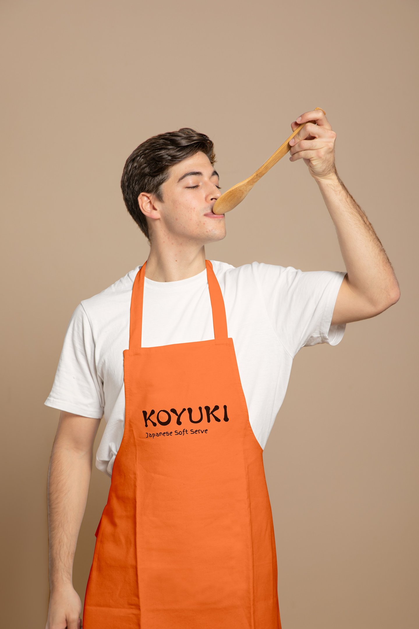
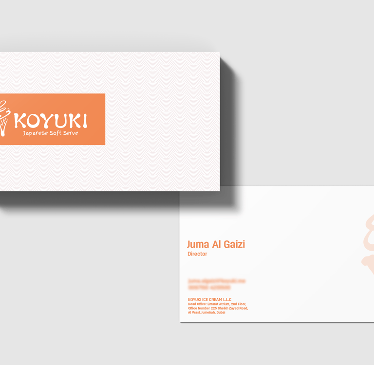
Koyuki
Food and Beverage, UAE
Overview
Born from the rich tradition of Japanese soft serve, Koyuki celebrates minimal indulgence with a clean conscience. The name itself means "snowflake," evoking purity, softness, and fleeting delight—all qualities reflected in their product made with 96% pure Japanese milk and zero artificial additives.
Packaging Design
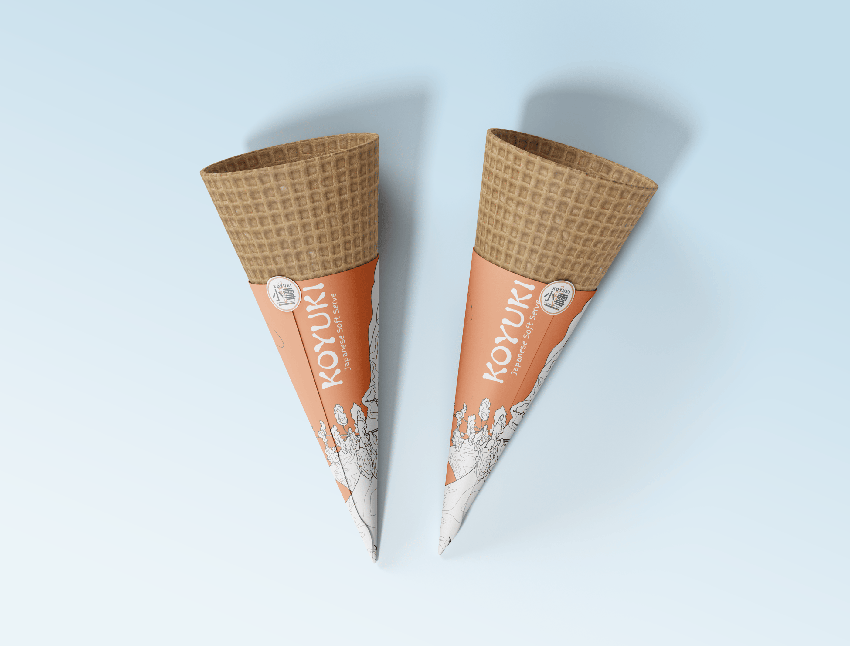
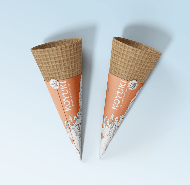
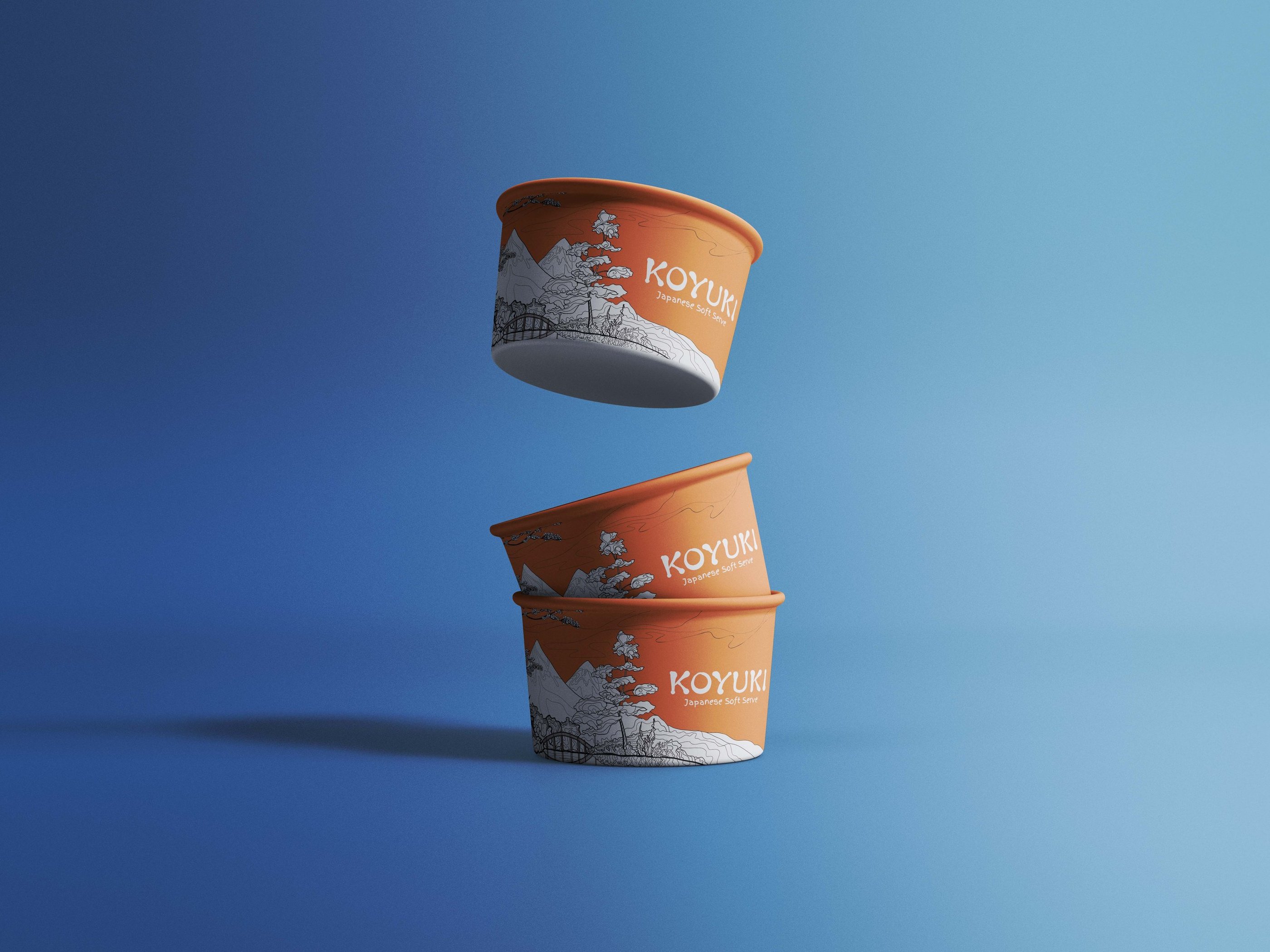
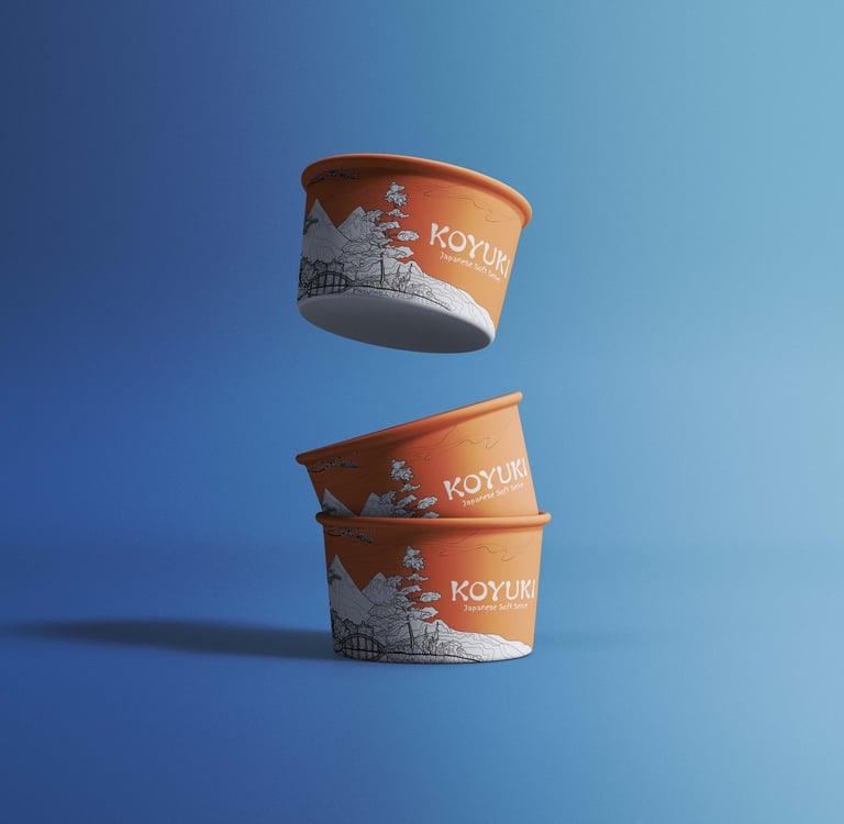
I led the packaging design for Koyuki’s signature cone sleeves and ice cream cups, translating the brand’s philosophy into tactile, visual form.
Key design highlights:
Visual Storytelling – Inspired by Japan’s iconic Mt. Fuji and traditional landscape art, I created a hand-drawn aesthetic that feels both organic and crafted, mirroring the care that goes into each swirl of soft serve.
Form Meets Function – The packaging was designed for operational ease without compromising visual elegance. Sleeves and cups were engineered to be stackable, clean in presentation, and Instagram-worthy on the counter.
Cultural Cues – The illustrated wrap is not just decorative, it tells a quiet story of origin, heritage, and craftsmanship that aligns with the brand’s ethos of “less sugar, more soul.”
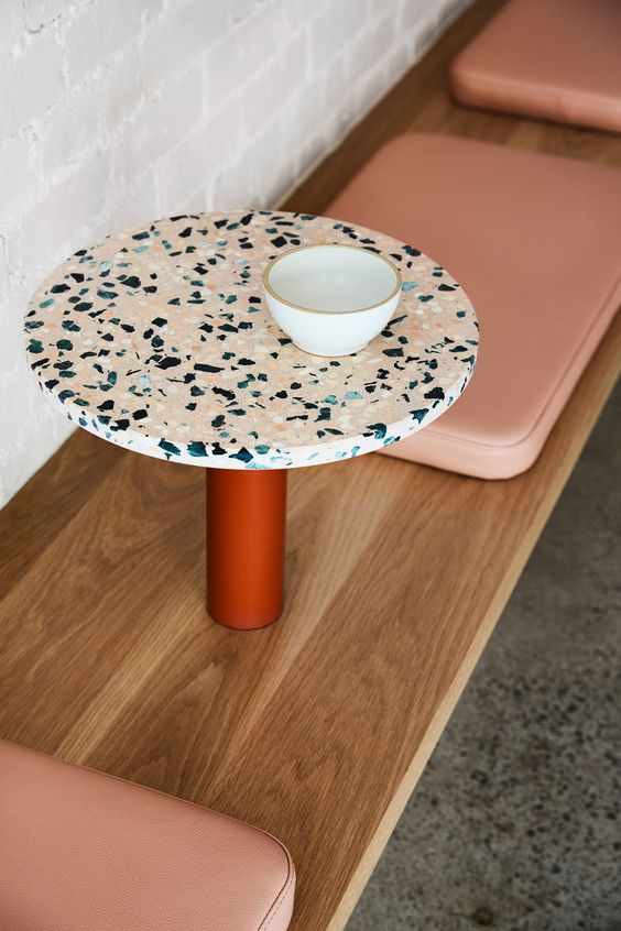
Extended Brand Elements
Beyond the packaging, I collaborated on extending the brand into its spatial and sensory environment:
Ambience & Furniture Direction – Suggested material palettes and visual treatments to echo the warmth and clarity of the packaging system.
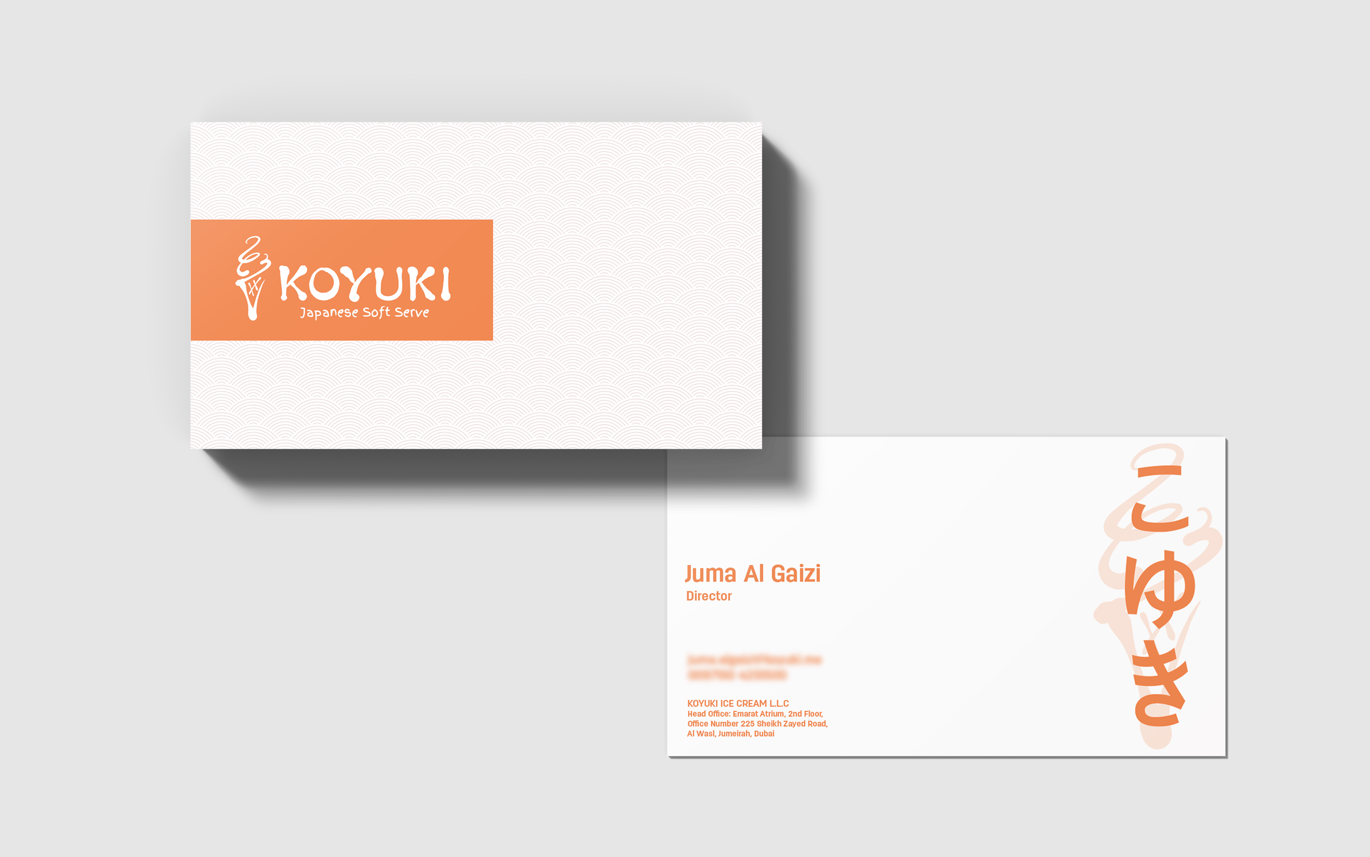
Mini Brand Refinements – Advised on the consistent application of logos, typography, and layout in both print and in-store elements to strengthen identity recall.
Impact
The packaging system became a core visual identifier for Koyuki, instantly recognizable for its warm tones and delicate linework. It helped position the brand as premium yet approachable—bridging the gap between Japanese heritage and modern-day minimalism.